Logos are more than just symbols; they are carefully crafted designs that hold hidden meanings, encrypted messages, and even fascinating stories. Many of the world’s most recognizable logos are filled with subtle details that grab attention and deepen the connection to the brand. These hidden elements, often overlooked at first glance, add layers of intrigue and creativity to the designs.
Let’s dive into the hidden secrets behind some of the most iconic logos you see every day.

1. The Man Behind Uncle Ben’s Logo
Uncle Ben’s, a popular brand of parboiled rice and other foods, first appeared on the American market in 1943. Since 1946, its logo has featured the image of an elderly Black man wearing a bow tie. According to one story, the man behind the logo is Frank Brown, a maître d’hôtel from Chicago.
Company owners reportedly noticed Frank during a dinner at a Chicago hotel and were so impressed by his warm demeanor and professional appearance that they paid him to use his likeness as the brand’s trademark.

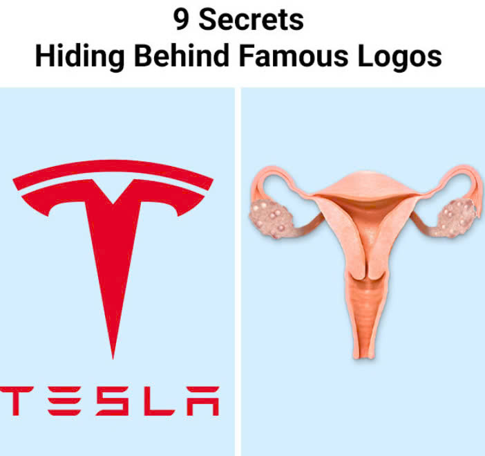
2. Tesla’s Logo and Its Connection to Nikola Tesla
Tesla Motors, founded in 2004 by engineers Martin Eberhard and Marc Tarpenning, pays homage to Serbian inventor Nikola Tesla. The company’s logo is sleek and futuristic, sparking plenty of speculation online. Some think it resembles a cat’s nose, while others jokingly suggest it’s inspired by the female reproductive system.
However, the truth is more straightforward: the logo represents a section of the electric motor that Nikola Tesla patented in 1883. This subtle nod to innovation perfectly aligns with the brand’s vision of advancing electric vehicles.

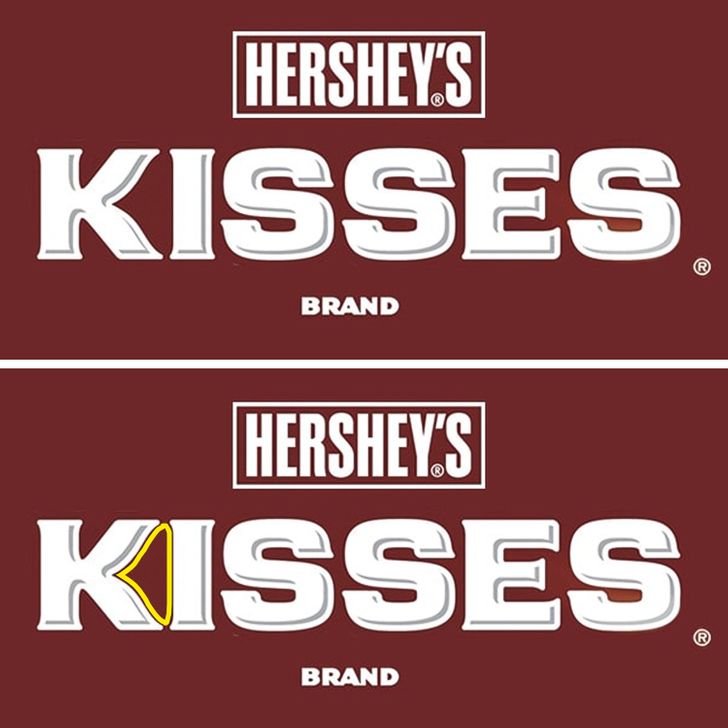
3. The Hidden Hershey’s Kiss
Hershey’s Kisses, the beloved American chocolate brand, has a clever design hidden within its logo. Look closely between the letters “K” and “I,” and you’ll spot the shape of a Hershey’s Kiss candy. This simple yet ingenious touch reinforces the brand’s identity in a way that’s both playful and memorable.

4. Quiksilver’s Wave of Inspiration
The logo of Quiksilver, a well-known surfwear brand, was directly inspired by Japanese painter Katsushika Hokusai’s famous woodblock print, The Great Wave off Kanagawa. The founders of Quiksilver, Alan Green and John Law, created the logo in 1973 to reflect the energy and beauty of surfing, blending traditional art with a modern brand identity.
5. Medusa’s Hypnotic Power in Versace’s Logo
Gianni Versace, the legendary Italian fashion designer, chose Medusa as the symbol of his brand in 1987. Inspired by the sculpture of Medusa Rondanini, the logo depicts Medusa’s transformation from a monster into a mesmerizing figure.
Gianni believed Medusa’s beauty and hypnotic power would captivate people, much like his designs. His hope was that anyone wearing Versace’s clothing and accessories would feel irresistible and unforgettable.
6. Tinker Bell, Not a Falling Star
The Walt Disney Pictures logo is iconic, appearing at the beginning of nearly every movie released by the studio. The image of the castle, inspired by Neuschwanstein Castle in Germany, evokes fairy tale magic.
Most people assume the light that arcs over the castle is a falling star, but it’s actually Tinker Bell from Peter Pan. This detail adds a whimsical touch that ties back to Disney’s legacy of storytelling and fantasy.
7. The Infinite Cow in The Laughing Cow Logo
The Laughing Cow cheese brand’s logo features a cheerful cow wearing earrings, but there’s a fascinating twist. Each earring contains the same image of the cow wearing earrings, creating an infinite loop known as the Droste effect. This clever design makes the logo memorable and intriguing, encouraging people to take a second look.
8. NASA’s “Meatball” Logo
NASA’s logo, often jokingly called “the meatball,” was designed by employee James Modarelli in 1959. The round blue shape represents Earth, while the stars symbolize space exploration. The red wing signifies aeronautics, and the curved line represents a spacecraft’s journey.
This timeless design encapsulates NASA’s mission to explore the unknown, combining science and imagination in a single image.
9. Lukoil’s Name Encodes Russian Oil Cities
Lukoil, the Russian oil company, has a name packed with meaning. The “LUK” in Lukoil is an acronym representing three oil-producing cities: Langepas, Uray, and Kogalym. The addition of “oil” ties the name directly to the company’s industry, blending geography and purpose seamlessly into its branding.
The Art of Hidden Meanings
These hidden details show that logos are more than just simple images—they are a blend of storytelling, creativity, and strategy. Each design choice serves a purpose, whether it’s paying tribute to history, adding visual intrigue, or strengthening the brand’s connection with its audience.
The next time you see a logo, take a closer look—you might discover a story hiding in plain sight. Whether it’s Tesla’s nod to innovation, Versace’s hypnotic Medusa, or the infinite loop of The Laughing Cow, these subtle elements make logos unforgettable.
What hidden secrets have you noticed in logos? Share your thoughts!


